A property’s outdoor space can look refined or chaotic depending on its color balance. A landscaping design that follows a structured color plan adds sophistication and raises curb appeal. The wrong mix of plants, hardscape, and accents can leave a garden feeling disconnected. The right choices, on the other hand, create unity and draw attention to key features. A property that achieves color harmony feels complete, natural, and welcoming.
The Role of Color in Landscaping Design
Color in landscaping design directs attention, shapes mood, and ties the garden together. Different tones bring contrast, while a cohesive palette ensures flow. Without careful balance, an outdoor space can feel cluttered or overwhelming. Thoughtful use of color makes the property feel intentional and visually appealing.
Warm vs. Cool Tones
Warm tones like reds, oranges, and yellows bring energy and excitement to a landscape. They make entryways, patios, or seating areas stand out as vibrant focal points. Cool tones such as greens, blues, and purples soften the design and create a sense of calm. Combining warm and cool tones keeps the space balanced, preventing over-stimulation. For example, pairing orange daylilies with soft blue hostas creates natural visual variety. This method ensures every color plays its role without competing for dominance.
Neutral Colors as a Foundation
Neutral shades ground landscaping color schemes and give them stability. Elements like gray stone, brown mulch, and beige paving create calm backdrops for brighter plants. They help prevent intense colors from looking overwhelming and connect different areas of the garden. For instance, a stone pathway in neutral tones makes vivid flower borders appear deliberate. Neutrals also tie in architectural details like patios or retaining walls. Using them well ensures a sense of structure across the landscape.
Creating a Color Strategy for Landscaping Design
A strong strategy prevents random color choices and creates harmony across the property. Planning with a defined palette reduces clashing tones and highlights architectural features. Seasonal shifts should also guide plant selection for year-round balance. Designing with color intention creates a garden that matures beautifully over time.
Understanding the Color Wheel Outdoors
The color wheel helps property owners understand how hues interact in landscaping. Complementary colors like purple and yellow create bold contrast, while analogous colors like blue and teal flow more subtly. Triadic schemes use three evenly spaced colors for variety without imbalance. Applying these ideas outdoors makes flowerbed arrangements feel cohesive. For example, red roses paired with yellow daisies and blue salvia follow triadic rules. Such intentional choices strengthen visual unity and avoid random mixes.
Seasonal Planting for Year-Round Balance
A landscape without seasonal planning can look lifeless during the off months. Spring provides bright blooms, summer adds lush vibrancy, autumn delivers golden foliage, and winter benefits from evergreens. Rotating annuals and mixing perennials with shrubs ensures consistency in every season. A bed of tulips in spring can later shift into dahlias for summer brilliance. Autumn foliage from maples keeps interest alive when flowers fade. Evergreens keep structural color intact during colder months.
Focal Points and Accent Areas
Color should draw attention to the areas that matter most in landscaping design. Front entrances, patios, fountains, and seating zones benefit from color placement that naturally leads the eye. Bold blooms or contrasting tones near these spaces create emphasis. Background zones can then rely on calming greens or muted tones for support. This contrast prevents the yard from looking crowded. Each accent area feels purposeful and reinforces the design’s flow.
Plant Selection for Color Harmony
Plant choices determine how color evolves across the property. Trees, shrubs, flowers, and grasses bring unique tones, shaping the atmosphere. A thoughtful blend adds structure and avoids clashing. Plants must be selected with attention to foliage, bloom cycles, and overall color contribution.
Trees and Shrubs as Color Anchors
Trees and shrubs set the foundation for outdoor color design. They provide structural presence and steady hues that ground the landscape. Like barberry or smoke bush, many shrubs add rich tones beyond green. Seasonal changes also offer natural variation, with maples turning red or gold in autumn. Anchoring these plants around the property ensures other colors feel supported. They act as permanent elements that keep the landscape steady through seasonal transitions.
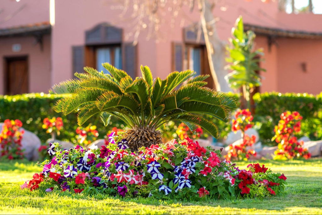
Flowers for Vibrancy and Contrast
Flowers bring bursts of brightness and help break monotony. Annuals offer fresh shades every season, while perennials provide consistent patterns. Combining bold flowers with softer ones prevents the garden from becoming overwhelming. White daisies beside deep purple salvia create balance while remaining eye-catching. Flower selection must account for bloom timing to maintain constant color. Careful combinations keep the space both lively and orderly.
Groundcovers and Grasses for Texture
Groundcovers and ornamental grasses add subtle but essential layers to design. Their muted tones and textures prevent flowerbeds from appearing too sharp or abrupt. Grasses add gentle motion in the breeze, softening bold plants nearby. Groundcovers like creeping thyme fill gaps and tie together borders. Their role is supportive rather than dominant, but they strengthen harmony. These plants finish the design without distracting from feature areas.
Vines and Climbers for Vertical Balance
Vertical elements prevent a garden from feeling flat. Vines and climbers add height and soften structures such as fences or trellises. Flowering varieties like clematis or climbing roses introduce new shades into higher levels of the design. These plants extend the palette upward, connecting ground-level plantings with built features. Choosing complementary vine colors ensures continuity rather than contrast overload. Vertical growth brings depth and richness that balance the overall space.
Hardscape and Color Harmony in Landscaping Design
Hardscaping choices affect landscaping design as much as plant selection. Stone, brick, metal, and wood bring stable tones that match or balance the garden. Poorly chosen hardscape can clash with plant colors and disrupt unity. Coordinated choices keep outdoor areas structured and attractive.
Pathways, Patios, and Walls
Paths and patios guide movement while reinforcing style. Using earthy tones in stone, concrete, or pavers provides a firm but neutral base. Retaining walls or edging in subtle hues support plants without distraction. Choosing warm or cool shades that mirror surrounding plants builds cohesion. For example, a muted gray stone patio highlights green foliage and vibrant flower beds. These connections give the design visual consistency.
Furniture, Pots, and Accents
More minor details like outdoor furniture and pots have an outsized effect on harmony. Furniture in coordinated tones reinforces the property’s design. Pots with accent colors can repeat shades from flowers, adding rhythm to planting areas. Overly bold or clashing choices disrupt balance, even if the plants are well-chosen. Accents should complement rather than compete with surrounding colors. This approach makes every outdoor detail feel planned.
Lighting Effects in Landscaping Design
Lighting shifts how colors are seen across a property. Natural light changes throughout the day, and artificial lighting creates nighttime ambiance. A design that ignores light risks losing harmony after sunset. Integrating lighting ensures color balance continues at every hour.
Natural Light and Seasonal Variations
Sunlight alters color tones depending on time and season. Bright midday sun can wash out pale flowers, while shaded areas make hues appear richer. Seasonal shifts in light add further variety, with winter daylight cooler than summer warmth. Understanding these changes makes plant placement more effective. A plant that looks dull in bright sun may glow in filtered shade. Planning around these shifts makes colors remain attractive throughout the year.
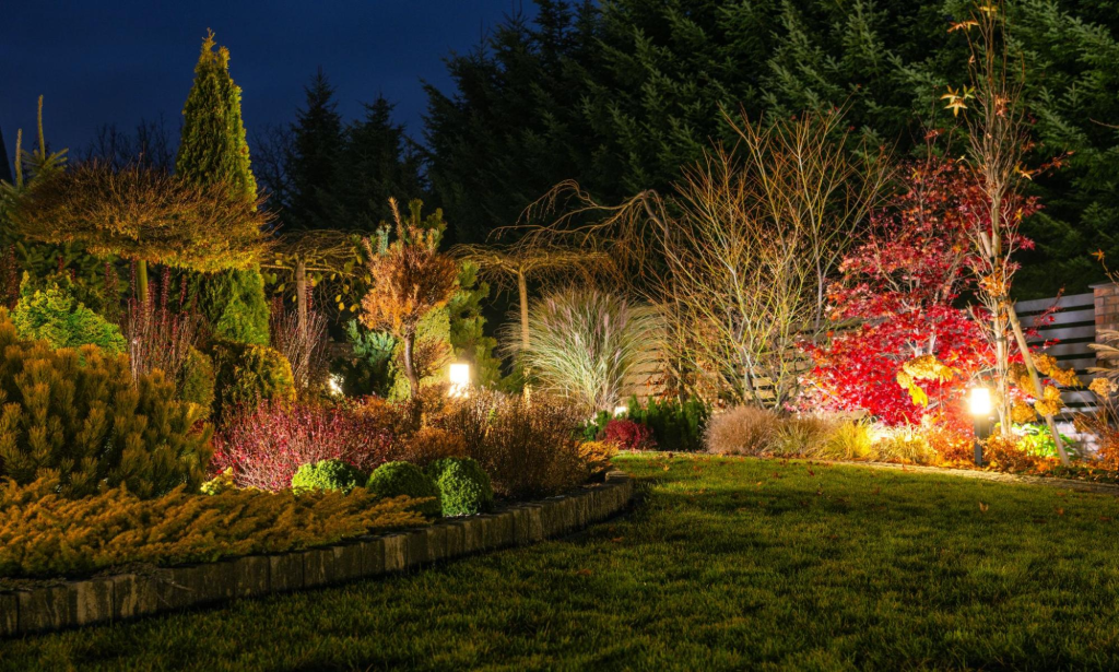
Outdoor Lighting for Night Harmony
Artificial lighting highlights landscaping after dusk. Warm fixtures create comfort, while cooler options bring a sleek modern touch. Uplighting trees or structures emphasizes form, while pathway lighting improves safety and design flow. Balanced placement avoids glare and keeps the scene inviting. Lighting should support plant and hardscape tones instead of overwhelming them. A coordinated lighting plan makes the landscape cohesive around the clock.
Smarter Choices for Landscaping Design Color Plans
Strong landscaping design begins with choices that support harmony and flow. Thoughtful planning avoids clutter, highlights seasonal interest, and aligns hardscape with plants. Every decision, whether it’s about flowers, foliage, or pathways, can reinforce unity. Property owners build land, natural, and well-connected landscapes, focusing on these positive strategies.
Creating Unity With a Focused Palette
A focused palette makes outdoor spaces feel cohesive and inviting. Limiting the design to three or four recurring tones allows colors to repeat naturally across different areas. This repetition gives the garden rhythm and balance without overwhelming the eye. Bright flowers, calming greenery, and neutral anchors all complement each other when chosen intentionally. With this approach, even bold plants look coordinated. A planned palette brings comfort and sophistication to the property.
Highlighting Foliage and Texture for Depth
Leaves and textures add character beyond seasonal blooms. Glossy, silvery, or burgundy foliage enriches the garden year-round. Mixing textures like smooth hosta leaves with airy ornamental grasses keeps the design layered and engaging. These variations prevent outdoor spaces from looking flat during the off-season. Even when flowers fade, interesting foliage maintains visual appeal. Highlighting texture ensures the landscape feels full and dynamic throughout the year.
Coordinating Hardscape With Plant Tones
Hardscape elements are lasting features that shape outdoor design. When chosen in harmony with plant tones, they reinforce color balance rather than disrupt it. Neutral stone, subtle pavers, or warm wood tones provide reliable backdrops for seasonal planting. Coordinated materials connect pathways, patios, and walls with surrounding greenery. This consistency makes every element feel like part of the same vision. Blending hardscape with plant colors strengthens overall unity in the landscape.
Landscaping Design Starts With Color Harmony
Color harmony is the foundation of any outdoor space that feels balanced, inviting, and lasting. Every well-planned garden begins with thoughtful choices about tones, textures, and accents. When those choices align, the result is a property that looks refined year-round and reflects pride in ownership. Investing in professional landscaping services centered on color harmony isn’t just about aesthetics; it’s about creating a setting that adds daily enjoyment and long-term value. Your outdoor vision starts with one decision: choosing a color plan that truly works.
Follow the Brady Landscaping & Construction blog for inspiration rooted in expertise and learn how color harmony can redefine your outdoor space.